Project Task/Challenge:
The specific challenge that prompted the creation of the FreshPod logo was to develop a brand identity that truly encapsulated the supermarket's commitment to freshness, sustainability, and community engagement. Initially, the client had a basic idea of what they wanted, but it became evident that a deeper understanding of the brand's essence was needed. Through extensive research and collaboration, we delved into FreshPod's brand identity, target audience, and industry landscape. Together, we agreed that the logo should not only be memorable and creative but also simple, reflecting naturalness and appealing to the target demographic. We identified the need to incorporate the letter "F" as the company's initial and a leaf symbol to convey freshness and environmental consciousness. Color-wise, we opted for a Daintree hue for the brand name and a Limeade Green for the foliage, reinforcing the natural and vibrant aspects of the brand.
Client's Expectations and Desired Outcomes:
The client's expectations were clear: they wanted a logo that stood out, communicated freshness and sustainability, and could rival competitors in the industry. They sought a design that would resonate with their target audience of health-conscious and environmentally aware consumers, ultimately aiming to create a strong brand identity that could withstand market challenges and establish FreshPod as a leading supermarket chain.
Influence of Brand Identity, Target Audience, and Industry Landscape:
The FreshPod brand identity, centered around freshness, sustainability, and community engagement, played a pivotal role in shaping the logo design process. We recognized that the target audience comprised individuals and families seeking high-quality, locally sourced groceries, prioritizing health, wellness, and ethical consumption practices. This understanding informed our decision-making, ensuring that the logo reflected the values and preferences of the target demographic while also distinguishing FreshPod within the competitive supermarket landscape.
Project Solution:
Before I embarked on the creative journey, I researched the company's target audience and competitors in-depth. Starting with a business sentiment and a mind map, I drew many sketches and selected five for further development. These concepts were refined into rough arrangements, with three options presented to the client for feedback and selection. Through collaborative dialogue, the chosen design seamlessly integrated the letter "F" with a leaf symbol, symbolizing freshness and environmental friendliness. The color palette was carefully chosen to evoke natural vibrancy and vitality, reinforcing FreshPod's brand values.
Incorporating Client Feedback:
Client feedback was integral to the design process as open communication and collaboration drove the project forward. The client and I worked closely to refine the chosen logo concept with mutual appreciation and respect for each other's input. This collaborative approach ensured that the final design resonated with the client's vision and goals for FreshPod's brand identity.
Final Delivery:
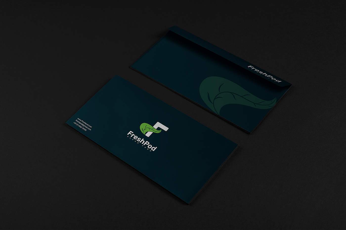
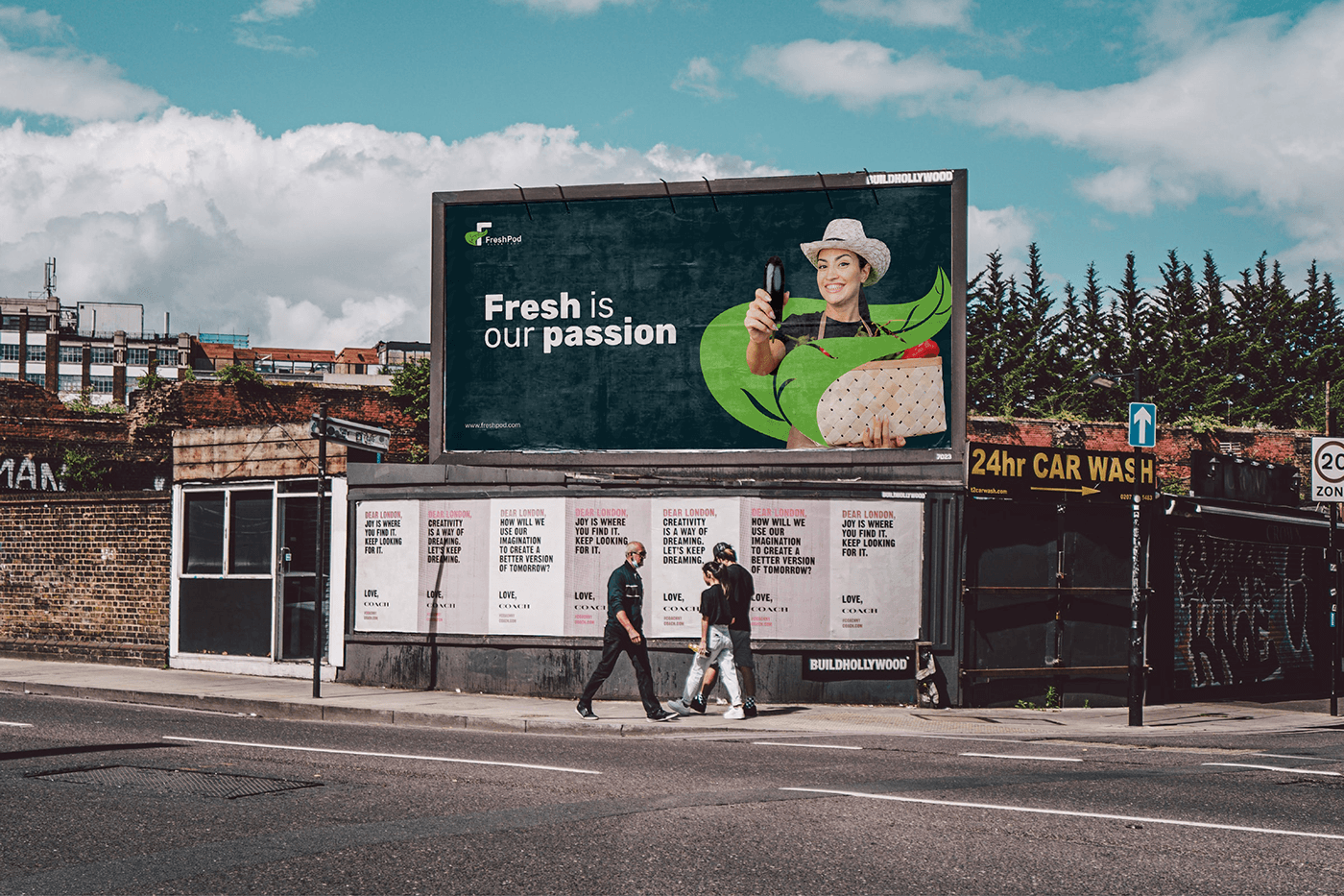
Upon completion, the client received a comprehensive package of deliverables, including logo transparency, vector, and printable files, as well as 3D mockups and stationery designs. Additionally, a social media kit and full copyright of the design were provided, enabling seamless implementation across various platforms and materials. The FreshPod logo now serves as a powerful symbol of trust, innovation, and excellence, elevating the supermarket's brand and resonating with its target audience of discerning consumers.